點叫 DimGiu v0.2: the thirty-second relative
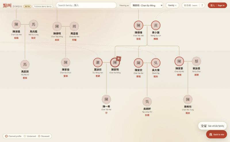
When I wrote up v0.1 in July, DimGiu was a demo: a fictional family you could click around, every relative labelled with what Chan Ka-Ming calls them. The engine was the whole story. Since then the question has been different and much less glamorous — what does it take for a real family to use this? — and the answer turned out to be about four months of unglamorous things. Here’s the arc, dead ends included.
First, a fresh pair of eyes. Before building anything new I had a second model review the whole codebase cold and try to break it, with a skeptic pass that re-ran the engine on every claim. It found 27 real things. The ones that stung were in the engine’s honesty: two paths of equal length through a family (double cousins — two brothers who married two sisters) resolved to 堂 or 表 depending on which order the edges happened to be stored in the JSON. Same family, different answer, decided by serialization. A great-granduncle’s wife came out as 伯婆 instead of 太伯婆 — one generation off. And the “older or younger?” prompt, which stored its answers as numbers on a line, could invent facts: answer “U2 is older than U1” and “U3 is older than Dad” separately, and the engine would confidently call U2 伯父, a comparison nobody had made. That last one is a small lesson in data modelling — a total order can’t hold partial knowledge — and the fix was to store the answers as what they are, pairs, and let transitivity do only the work it’s entitled to. Everything else from that pass is in the changelog inside the app; the suite went from 235 tests to 279, and today it’s past 500.
Photos, before the backend existed. Faces matter more than names to the aunties this is for, so profile photos came next — and they came local-first, like the editing did: you pick a photo, a small crop dialog opens already fitted so doing nothing gives a sensible result, and the face is saved as a tiny 192-pixel image inside the family record itself. No upload, no storage bucket, and because the share links were already end-to-end encrypted, photos ride inside them for free. Deceased relatives’ photos go to ink. The number that made this possible: a cropped face is two to five kilobytes.
Then the actual backend. Accounts went live in August — email link (no password; the people this is for do not do passwords) plus Google — with the family stored as one transactional document and a revision counter so two devices can’t silently clobber each other. The part I’m most comfortable with is the security rules: 67 adversarial tests run against a real Firestore emulator on every change, trying to forge membership, skip revisions, read someone else’s family, or answer a link twice. The part I’m least comfortable with is the first sign-in email landing in my own spam folder, which is still on the list.
A corner redesign, from a mockup. With accounts in, the top-right of the screen had five loose controls and no sign-in button at all — the way in was buried in a menu. I had three directions mocked up in the app’s own paper-and-ink style and picked a mix: the controls grouped into actions · utilities · identity, with sign-in as the one solid red button in the whole chrome. Red otherwise means you in this app (the seal on your own node, the thread to whoever you tap), so spending it on a button was a deliberate choice, not a default.
Numbered uncles. This is the feature every Cantonese elder asks for on sight: your father’s brothers are not three 叔叔s, they’re 大伯, 二叔 and 三叔, and the ordinal replaces the generic word — 二叔, never 二叔叔. DimGiu computes the number at read time from birth years, storing nothing new on anyone. The design went through five revisions in four days, driven by asking around other families how they actually tell relatives apart. The surprise: it isn’t one rule. My mother’s side numbers the aunts and paternal uncles but names the 舅父s by the last character of their given name — 明舅父, with his wife taking the same character, 明舅母 — and another family names everyone and numbers no one. So the setting became one question, “How does your family tell apart relatives who share a title?”, with four answers: don’t, by number, by name, or choose for each relative. The honest version of a feature is usually a question, not a switch.
Privacy, and what I was actually promising. When I started thinking about Facebook login I half-decided to stop saying “privacy-first” — the family lives on my servers now, after all. Then I went looking for where the product actually said that, and it didn’t. What it promised was private by default: nobody sees your family unless you let them in, no indexing, no ads, no selling anything. Storing a family on a server is entirely compatible with that; every app with accounts does it. So the promise stayed, and got written down properly as a privacy page with a real deletion path, because Meta’s login requires both. Then I read what else Meta requires — business verification and app review to take a login app live — and removed the Facebook button I’d just built. Email link and Google it is. Apple sign-in waits for the day there’s an iOS app, where it becomes mandatory anyway.
The thirty-second relative. The thing that actually unlocked the next step came from using the app on my own family: entering names and relationships is easy; birthdays are the hard part. You don’t know your aunt’s birthday. She does. So now, on any relative’s card, I can tap “Ask them to fill in their details,” which mints a link and a WhatsApp-ready message.
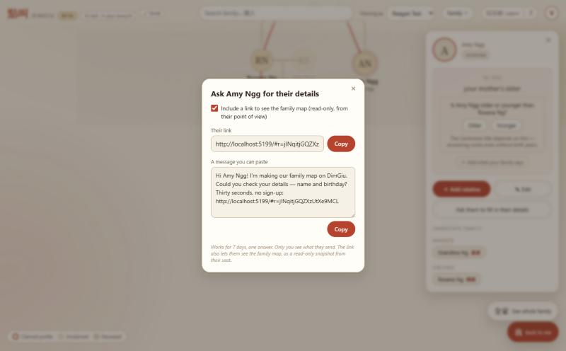
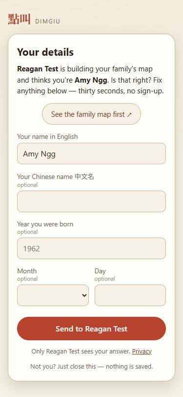
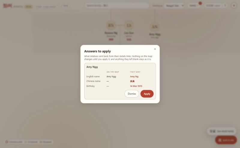
What they open is deliberately tiny: no account, no map, just “Reagan is building your family’s map and thinks you’re Amy Ngg. Is that right?” with three fields — English name (prefilled, fix the spelling), Chinese name, birthday — and a button. It works on a phone held upright, which is where everyone will open it.
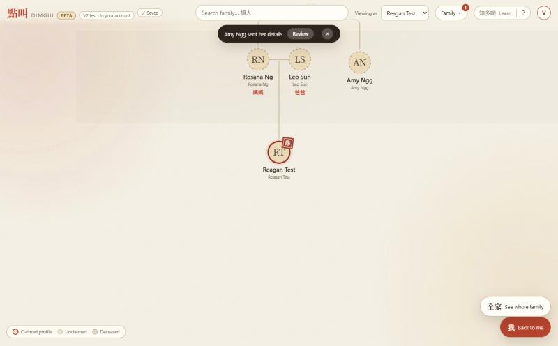
Two things about the design I’d defend. First, the relative can never write into the family directly: their answer lands as a suggestion that I review and apply, side by side with what the map has now. Second — and this came from my own first run, where I had no idea an answer had arrived — there’s now a badge on the Family menu and a notice the moment one shows up.
The best part is a side effect. The link can also open the family map — read-only, and from the relative’s own seat, so the first thing Amy sees is what she calls everyone. That’s the whole product, delivered before she’s typed a word, and it’s the soft on-ramp to the thing v0.1 promised: relatives eventually claiming their own profiles. Links last seven days and take one answer; then they ask you for a new one.
Along the way, full birthdays became optional — the engine still only needs the year to order people, but when two cousins were born the same year the month and day now settle 表姐 versus 表妹 honestly — and a phone held upright gets a one-time “turn it sideways” tip, because a generational tree is landscape-shaped and I refused to build the “please use a desktop” popup. The relatives who matter are on their phones, on the bus.
Still no one outside me has used it. That’s the next step, and for the first time the app is ready for it: the first round of relatives get a link, a thirty-second job, and a map of their own family from their own seat. Next on the build list is letting them suggest details for each other from that map — “Marlene suggested this for Joshua” — and then the beta round proper.